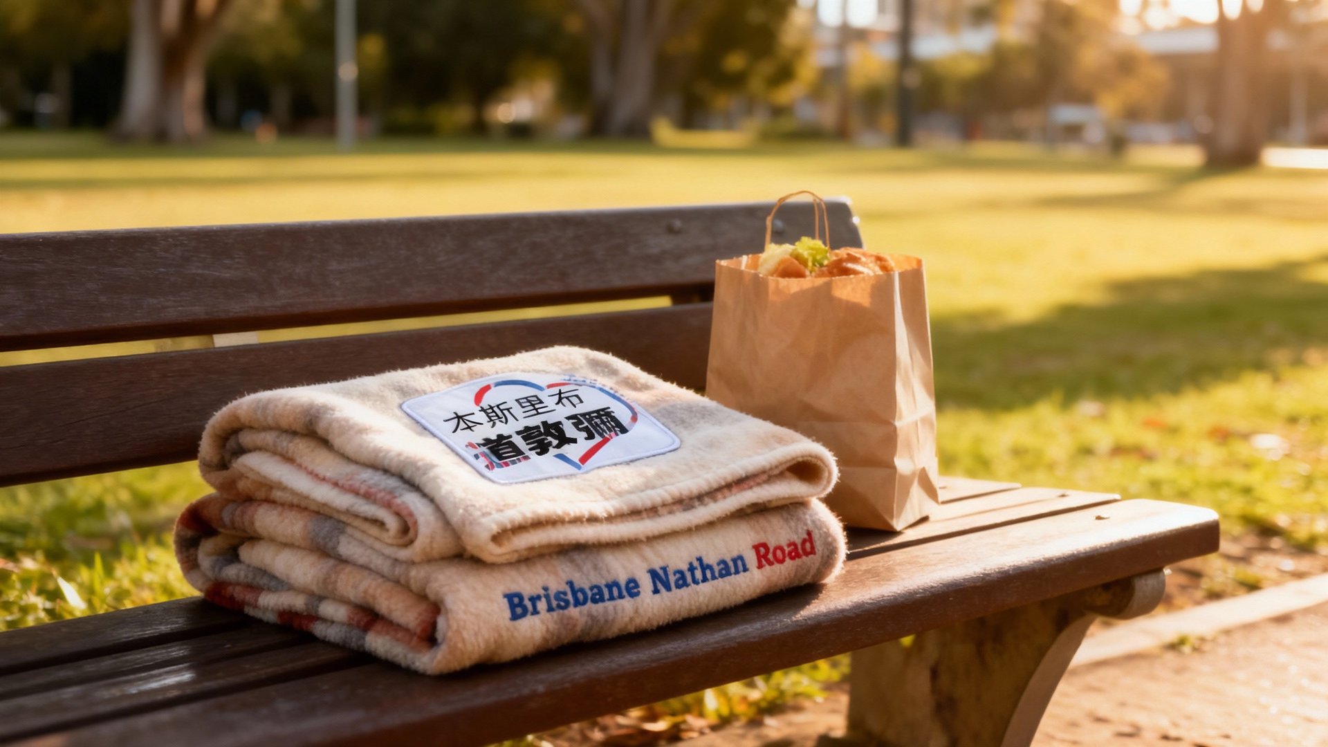
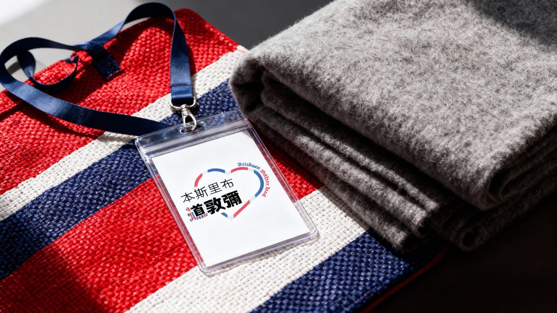
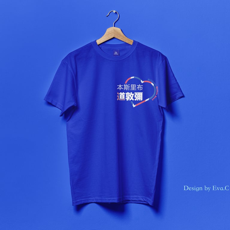
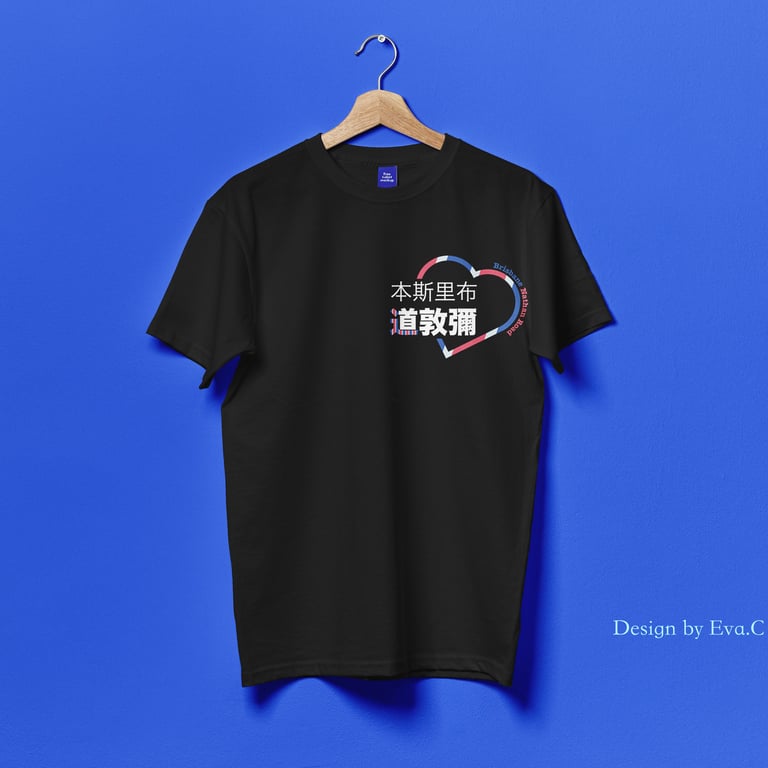
Logo design for a nonprofit group uniting Hong Kongers in Brisbane to provide direct support for the local community.
Objective:
To design a meaningful and recognisable logo for print on T-shirts (10x10cm) that resonates deeply with the Hong Kong community while remaining accessible to a broader Australian audience.

The Creative Challenge:
To integrate both Chinese and English text legibly within a compact space.
To embed layered cultural significance without compromising the logo's visual clarity.
To create a symbol that fosters a sense of identity and shared purpose.
Design Solution:
I developed a logo that acts as a visual narrative, connecting the organisation's mission with the Hong Kong-Australian immigrant experience.
Core structure:
A heart shape seamlessly integrates the organisation's Chinese name, symbolising compassion and core charitable values. The English name "Nathan Road Brisbane" curves around the heart of the community, clearly stating its location in a universally understood language.
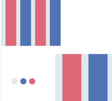
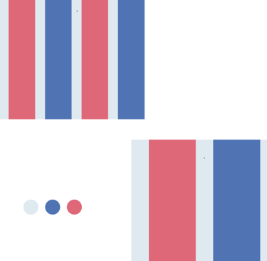
Colour:
The logo uses the iconic Red, White, and Blue colour scheme. This is a direct reference to the durable nylon woven bags ubiquitous in Hong Kong culture — a symbol of travel, resilience, and carrying one's life across oceans.
And also, Blue is represented by Brisbane, and Red is represented by Hong Kong.
Metaphor:
This identity centers on the Chinese radical ‘舟’ (boat), extracted from the organization's name. Rendered in the iconic Hong Kong red, white, and blue, this single stroke becomes a vessel carrying profound cultural meaning.
Cultural Code: The 'boat' radical, evoking the spirit of 同舟共濟 (crossing the river together), is the narrative foundation.
Visual Metaphor: The red, white, and blue stripes symbolize the iconic travel bags of Hong Kong migrants.
Unified Story: This fusion creates a powerful emblem of shared journey and mutual support, connecting heritage to a new mission of community aid in Brisbane.
Cultural:
The design cleverly incorporates stripes and grid patterns reminiscent of the classic bag. This embeds a "cultural code" that resonates instantly with Hong Kongers, creating an immediate sense of belonging and understanding, while appearing as a vibrant and friendly pattern to the wider community.
Final Result:
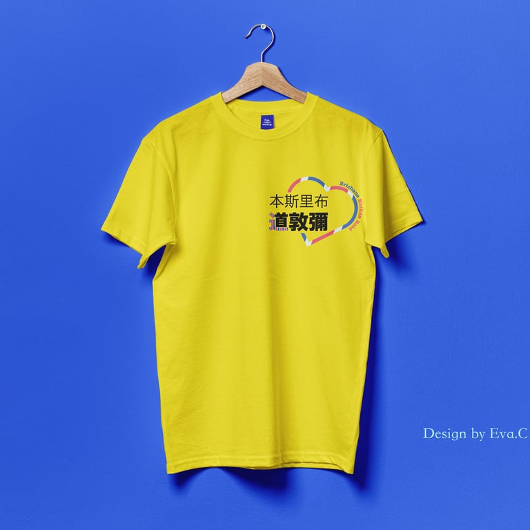
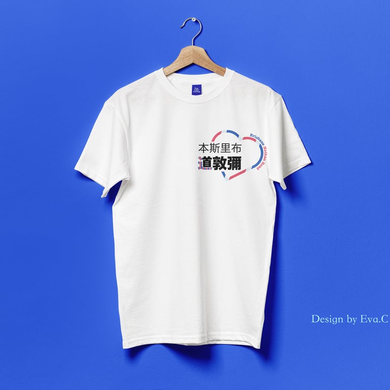
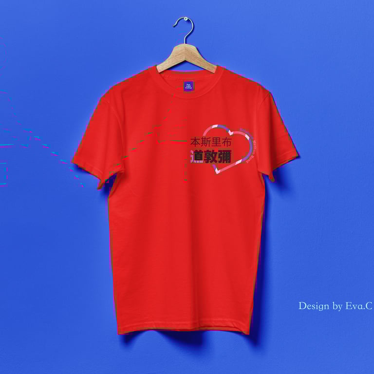
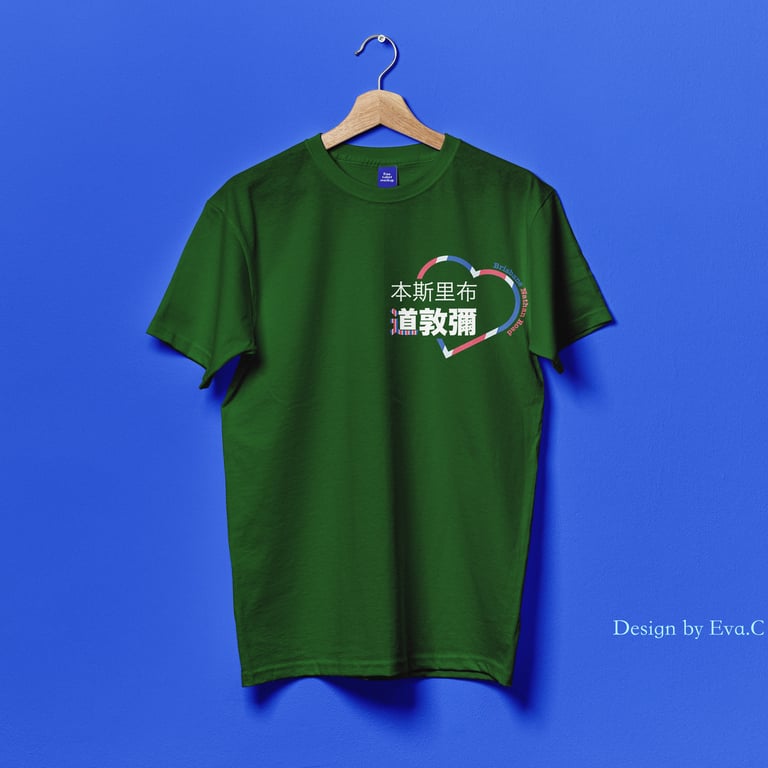
Designed with both form and function in mind, this logo maintains its integrity across all applications. It reproduces with perfect clarity on diverse T-shirt colors and is instantly recognizable at a range of distances, ensuring your organization immediately establishes a strong visual presence.
Design outcome:
This logo is a bridge between heritage and purpose. For Hong Kongers, the red, white, and blue heart—built from the "boat" (舟) radical—is a profound symbol of their journey, echoing the iconic travel bags and the spirit of "crossing the river together." For the wider community, it's a clear, compassionate heart, communicating charity and welcome to all in Brisbane. It transforms cultural memory into a universal emblem of support.