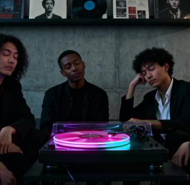
Building an immersive sensory experience for the underground digital music scene.
Brand Positioning
Target Audience
Highly educated music enthusiasts aged 25-35.
Active participants in underground music scenes.
Vinyl record collectors and audiophiles.
Experience-driven quality seekers.
Market Positioning
"A premium house music label from the Gold Coast, specialising in digital and vinyl releases."
Brand Personality
Progressive yet approachable.
Professional while maintaining underground authenticity.
Sophisticated yet accessible.
Project Challenge
Core Problem
Establishing a unique and memorable brand positioning for a new record label in an increasingly competitive music market.
Specific Challenges
Achieving brand differentiation in a highly saturated electronic music in the globel market.
Precisely reaching and attracting highly educated, discerning young audiences.
Creating a visual experience system that matches the immersive quality of House music
Maintaining underground culture authenticity while ensuring commercial viability.
Strategic Solutions
Core Concept: Sensory Resonance
Materializing the physical vibrations and psychedelic experience of music through visual language, creating an immersive brand experience that integrates sight and sound. We transform sound frequencies, rhythms, and energy into visible visual elements, making the brand not just seen, but felt.
Design Principles
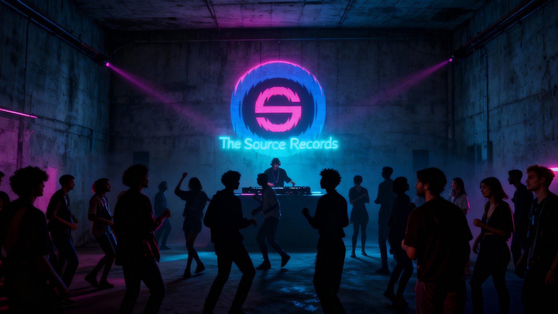
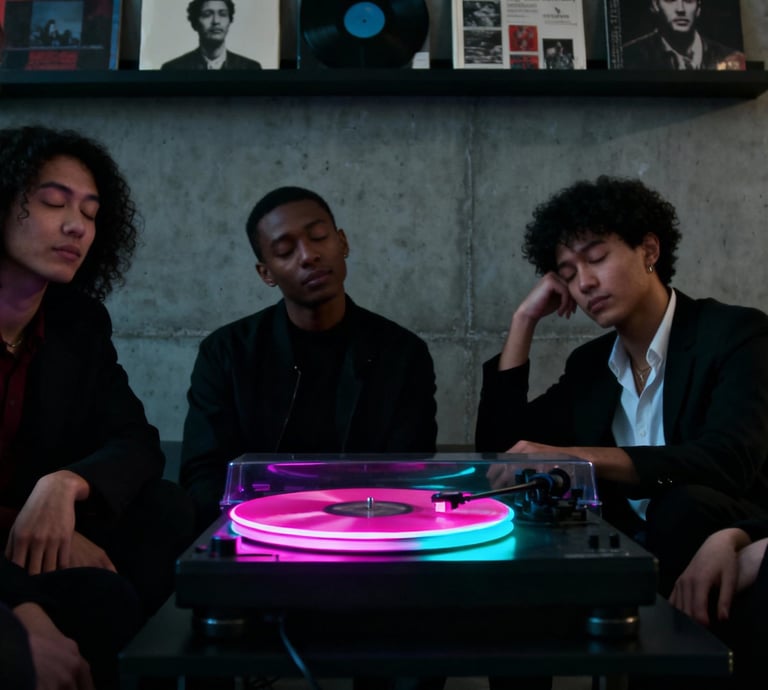
Visualized Sound Waves: Using op art and motion graphics to express audio vibration frequencies
Immersive Experience: Creating visual intensity through color and form that matches musical emotions
Intelligent Minimalism: Communicating with highly-educated audiences through precise design language
Underground Spirit: Maintaining raw, authentic underground genes within commercial design

Execution Strategy
Developing hypnotic rotating visual symbols
Utilizing fluorescent color schemes to create energy and tech aesthetics
Enhancing visual impact through motion design
Establishing a complete brand touchpoint experience system
Visual System Showcase
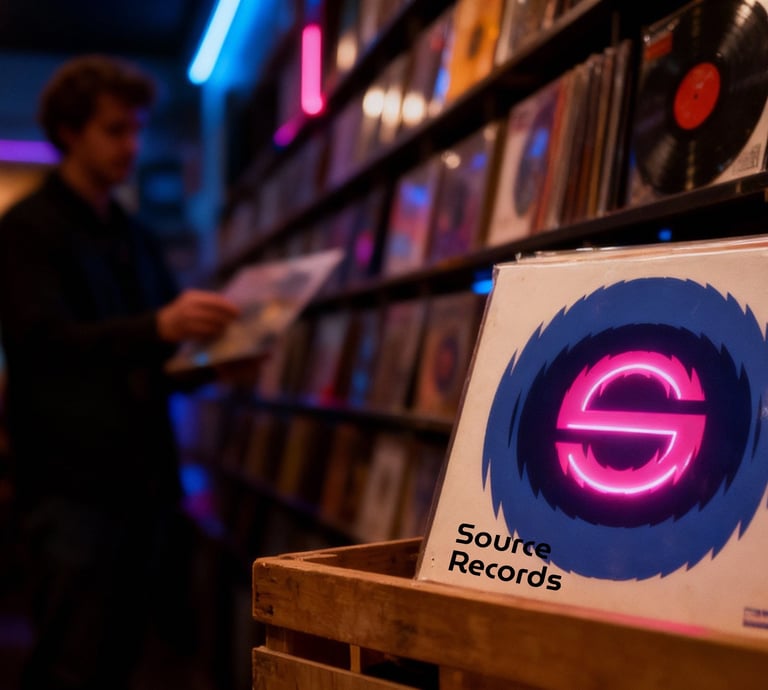
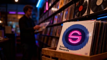
Logo Design
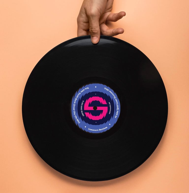
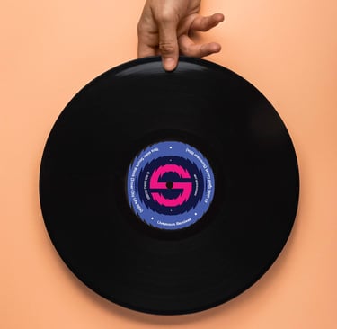
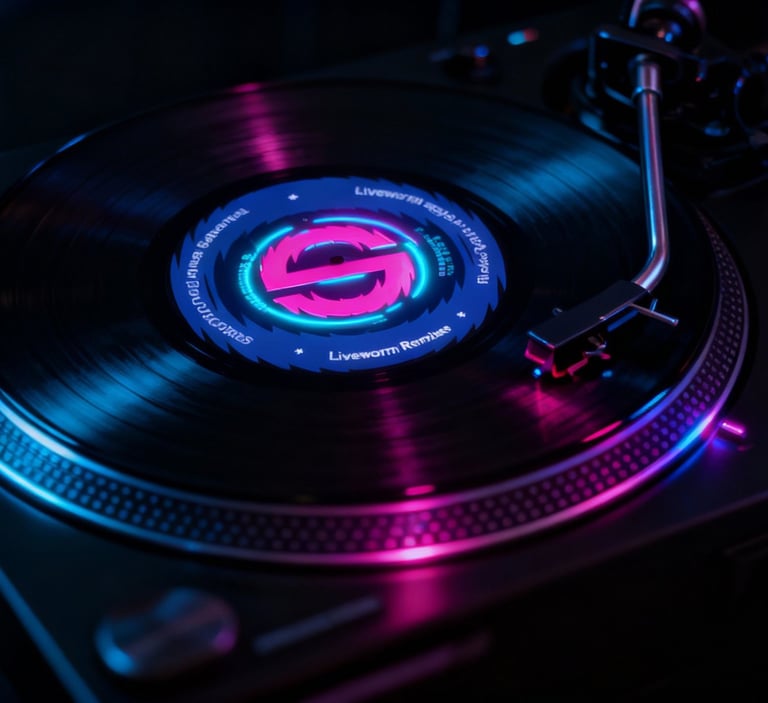
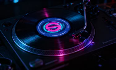
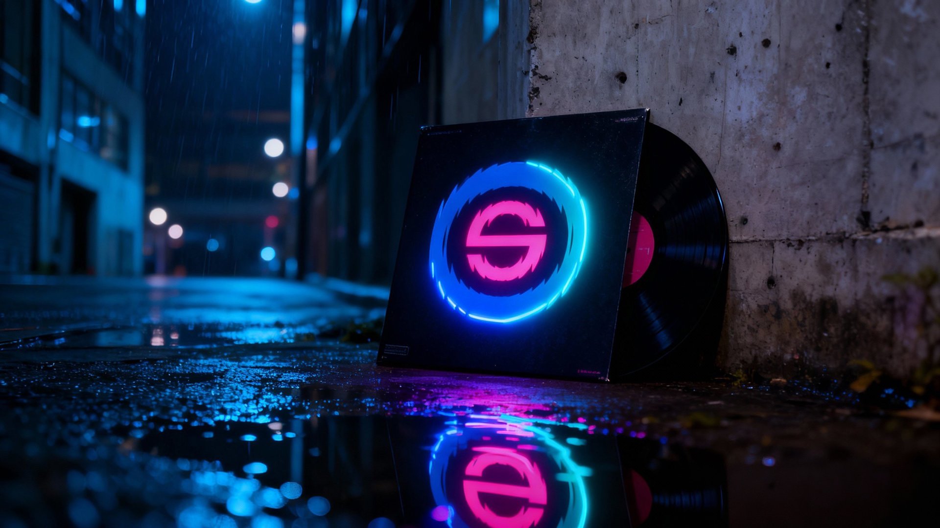
Core Icon: A dynamic Op-Art circle, creating a sense of visual vibration.
Logo Lock-up: Icon + "Source Records" wordmark.
Animated Version: A continuous rotation, enhancing the psychedelic experience.
Color System
Fluorescent Pink – Represents energy and passion.
Fluorescent Cyan – Represents technology and calm.
Deep Black – Provides contrast and depth.


Core Applications
Vinyl Label Design
Digital applications