David meets technology: learning without boundaries.
Queensland Collage of Art and Design open day Branded Merchandise Collection
Objective:
The design embodies QCAD's core values and translates them into a visual language that resonates with high school students, telling them: This is the creative starting point where tradition and the future converge.
Design Challenge:
The outcome can show the school’s value.
Uses only 3 colours (print limit).
Connects to future student – not just “catches the eye”.


Design Solution:
QCAD unique value + QCAD future vision + location.
Uses only 3 colours, pink, red, and maroon reflected the QCAD brand colour.
Connects to future students – gives out a hope message.
About QCAD:
Queensland College of Art and Design is the oldest art school in Queensland. QCAD equip students with future-ready skills while staying grounded in artistic legacy and Queensland's creative spirit. QCAD provide the value of :
Career-Oriented Education with Industry Links.
Interdisciplinary Learning and Future Technology Integration.
Queensland's Local Culture with a Global Perspective.
Socially Engaged Practices and Sustainable Development.
Core structure:
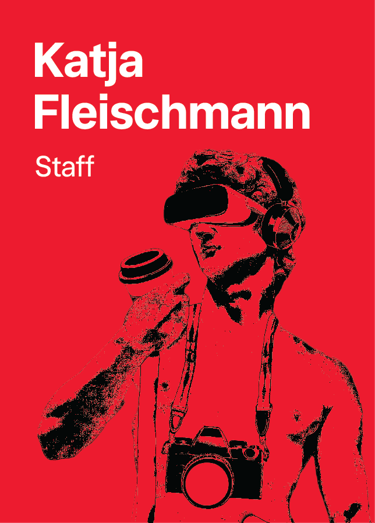
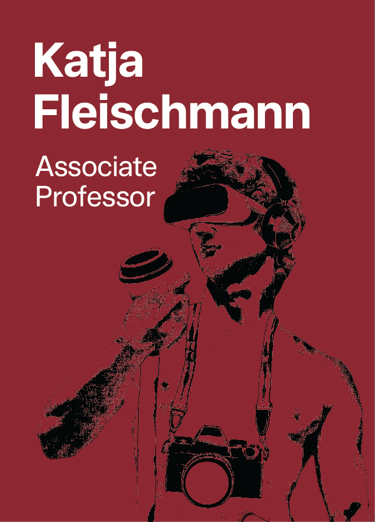
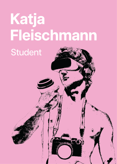
This design merges classical David with digital elements and Queensland's relaxed culture. It visually communicates QCAD's unique value: honouring artistic legacy while embracing future technology in Brisbane's creative environment. The three-colour scheme represents this fusion, creating immediate recognition and emotional connection with future students.
Michelangelo's David connects to QCAD with a touch of humour:
I playfully place this classical icon in modern scenarios – like a stressed student or a tech user – to show QCAD’s blend of tradition and innovation. It’s a lighthearted nod to art history, made relatable for today’s creators.
Design elements:
The integration of technology symbolises QCAD's commitment to future-ready education, while casual elements like thongs and coffee reflect student life and Queensland's laid-back culture. Together, they create a relatable identity that bridges innovation, local spirit, and student authenticity.


Design intention:
Sense of Humour Tagline:
Even David's learning new tricks."
Bridge classical art and modern technology through a relatable, humorous lens—showing that even iconic figures like David are evolving with the times. This approach makes QCAD's forward-looking education feel accessible, inclusive, and engaging to future students.


Core message connection:
This humorous approach delivers a powerful message: If even the masterpieces of history are learning new skills, so can you. It speaks directly to creative minds of all ages and backgrounds, breaking down barriers and inviting everyone to explore their potential at QCAD's Open Day.

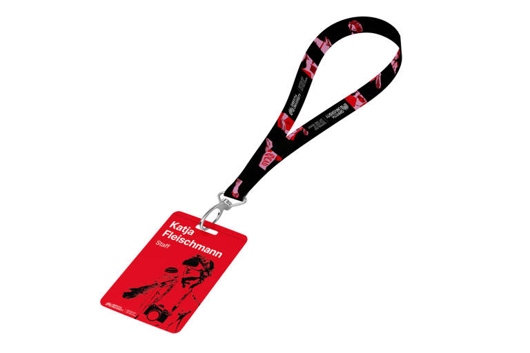
Landyrard design:
We deconstruct our core "Digital David" graphic into key elements, arranging them in a dynamic grid alongside the QCAD logo. This creates a modern, layered pattern that is instantly recognisable and deeply connected to the main design.
Name badges:
This approach creates a cohesive, professional, and functional set of name badges. The colour coding allows for instant recognition of a person's role, while the consistent typography and graphic treatment maintain a strong, unified brand identity.